Color tags in image selection: how clients get through large galleries
A simple favorite heart rarely suffices. With color tags and markups right on the image, clients structure even 800-image galleries — and you understand immediately what's meant.
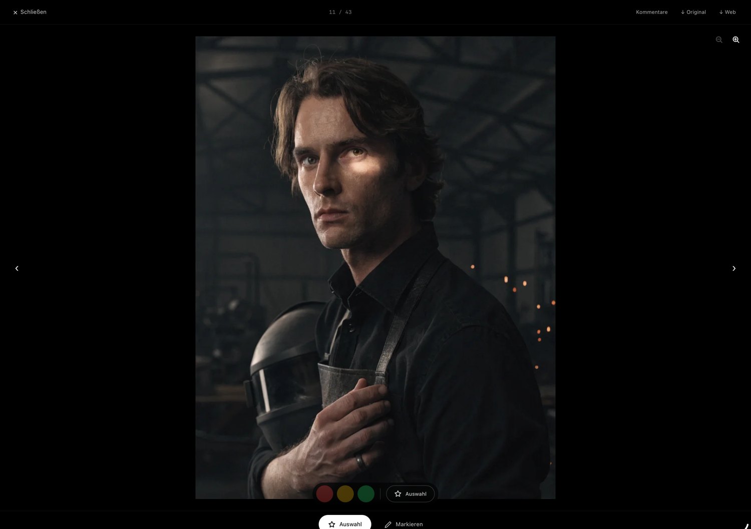
A single “like” per image is okay for small galleries. But as soon as it’s about several hundred shots — a wedding, a multi-day event, a large product series — the simple favorite heart hits its limits. The client doesn’t just want to say “yes” or “no”, but to grade. That’s exactly what color tags are for.
Why a yes/no is too little
In practice, on the first pass a client often has three categories in mind: “definitely this one”, “this one maybe” and “this one out”. Anyone with only a favorite checkmark has to keep that differentiation in their head or write it into a separate list. Both are tedious and lead to vague feedback like “take the nice ones”.
A traffic-light system solves this: green for the sure hits, yellow for the candidates, red for the rejects. The client works through the gallery in one pass without forcing decisions they’re not ready for yet.
Mark instead of explain
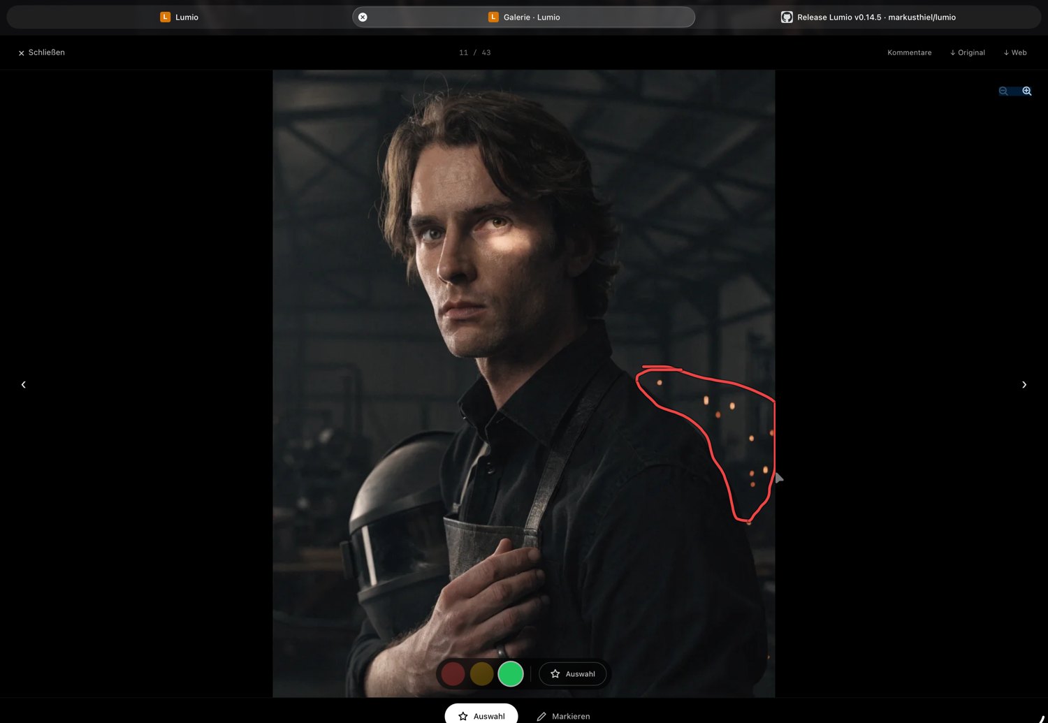
The second common hurdle is detail requests. “On this image, please remove the trash can in the background” — described by email, that costs several messages and often ends in misunderstanding. If, instead, the client can draw right on the image what they mean, the matter is clear in seconds. You see the markup, immediately know which spot is meant, and can reply with a note of your own.
The benefit for your workflow
Color tags and markups aren’t just client comfort — they save you work. Instead of a long email with image numbers, you get a sorted gallery back: what’s green gets edited, what’s yellow you discuss briefly, what’s red drops out. The detail requests hang on the right image, not in a separate document.
That noticeably shortens the loop between first gallery send and final approval — and that very loop is the real time sink on many jobs.
Conclusion
The larger the gallery, the more important graded selection becomes. A three-level color system plus the ability to mark right on the image replaces vague emails with sorted, unambiguous feedback. That’s more pleasant for the client and faster for you.
Lumio is built exactly for that: clients assign color tags per image (red/yellow/green), mark favorites and draw notes right on the image — and you reply with your own markups, without ever leaving the gallery.